


This guide is part of our complete WordPress tutorial series — a structured roadmap designed to take you from absolute beginner to advanced WordPress user step by step.
If you’re just starting your journey, we highly recommend following the tutorials in order so you build a strong foundation instead of jumping randomly between topics.
Start here: Complete WordPress Tutorial: Beginners to Experts
New to WordPress? Before choosing a theme, make sure you understand the difference between posts and pages. Read our full tutorial here: Posts vs Pages in WordPress – What’s the Difference?. If you’re completely new to WordPress, we recommend first reading our guide on What Is WordPress and How Does It Work? to understand the platform before diving into themes.
When a first-time visitor lands on your website, they make a snap judgment within seconds. They’re not analyzing your color scheme or reading your hero headline—they’re looking for the menu. It’s the digital equivalent of eye contact and a firm handshake. If your navigation is confusing, broken, or cluttered, that visitor is gone before you can say “bounce rate.”
At wpthrill.com, we believe that mastering your site’s navigation is the single most important technical skill you can develop as a site owner. In 2026, WordPress offers more flexibility than ever before, but with great power comes great responsibility. The days of simply slapping a few page links at the top of your screen are long gone. Today’s menus need to be responsive, accessible, SEO-optimized, and often, they need to do heavy lifting with mega menus and custom integrations.
Whether you’re building a new site on a classic theme or diving into the latest Full Site Editing (FSE) block themes, this guide will walk you through every method, trick, and best practice to create menus that don’t just work—they perform.
Quick Start: Create a WordPress Menu in 60 Seconds
- Using a Classic Theme? → Go to Appearance → Menus
- Using a Block Theme? → Go to Appearance → Editor
- To create dropdowns → Drag menu items slightly to the right
- To assign menu location → Select “Primary Menu” or Header location (It can be different based on the selected theme)
- Want advanced styling? → Use a visual builder like Elementor (Elementor does provide different options and extensions for mega menu design too)
Table of Contents
- How to Create a Menu in Classic Themes
- How to Create a Menu in Block Themes
- How to Create Dropdown Menus
- Mobile Menu Optimization
- Advanced Menu Strategies
- Frequently Asked Questions
Why Your 2026 Menu Strategy Matters More Than Ever
Before we click a single button, let’s look at why menus deserve your full attention this year.
-
Core Web Vitals & User Experience: Google’s algorithm in 2026 heavily prioritizes user experience. A menu that is slow to load on mobile, difficult to tap, or hides essential pages is a direct signal that your site offers a poor experience.
-
Mobile-First Indexing: Google predominantly uses the mobile version of your site for indexing and ranking. If your desktop menu looks great but your mobile menu is an afterthought, your SEO will suffer.
-
Semantic SEO: Search engines use your menu structure to understand the hierarchy of your content. A well-organized menu helps Googlebot crawl your site more efficiently and understand which pages are most important.
-
Conversion Pathways: Your menu isn’t just for browsing; it’s a conversion tool. Placing a “Shop Now” or “Contact Us” link prominently in your menu can dramatically increase click-through rates.
Understanding Your Theme: The Classic vs. Block Editor Divide
In 2026, WordPress themes generally fall into two categories, and your menu creation process depends entirely on which one you’re using. Let’s clarify this upfront to save you time. Want to choose the perfect theme? Explore our ultimate WordPress themes guide for all the details.
1. Classic Themes (or Hybrid Themes)
These themes (like many popular premium themes) still use the traditional Appearance > Menus screen. It’s a standalone interface, separate from the rest of your page builder, and is perfect for users who prefer a simple, form-based approach.
2. Block Themes (Full Site Editing)
These are the future of WordPress. Themes like Twenty Twenty-Five and others built for FSE integrate menu creation directly into the Appearance > Editor. Here, menus are managed using the Navigation Block, allowing you to design your menu in real-time, right alongside your header and logo.
We’ll cover both methods in detail below, so you can follow along no matter what theme powers your site.
Method 1: How to Create Classic WordPress Menus
This is the traditional “dashboard-style” menu builder. It’s reliable, distraction-free, and incredibly powerful. Here’s your step-by-step guide.
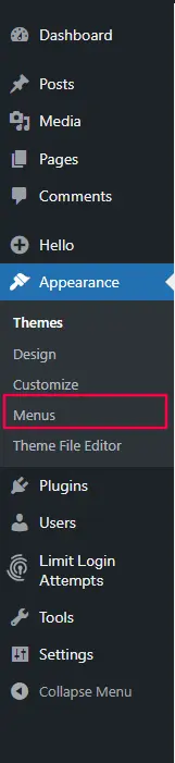
Step 1: Navigate to the Menu Dashboard
Log in to your WordPress admin panel. On the left-hand sidebar, hover over Appearance and click on Menus.
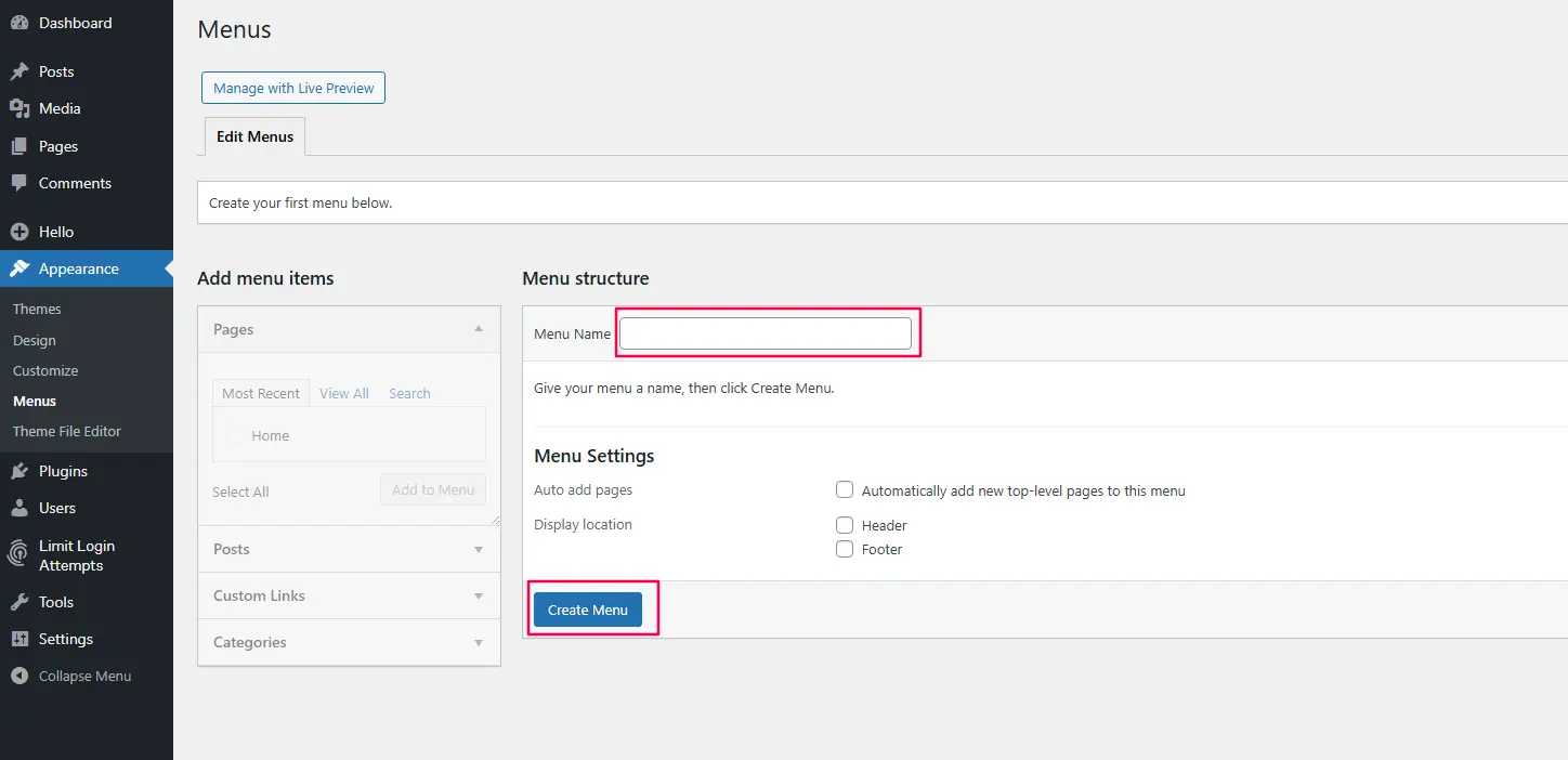
Step 2: Create Your First Menu Structure
At the top of the page, look for the tab that says “Create a new menu.” Click it.
-
Menu Name: Enter a name that helps you identify it, like “Header Main Menu” or “Footer Links.” This name is for your eyes only.
-
Create Menu: Click the blue button to create your new, empty menu.
Step 3: Populating Your Menu with Items
The left side of the screen is your toolbox. It contains all the different types of content you can add to your navigation.
-
Adding Pages: The “Pages” panel lists your most recent pages. Check the box next to the pages you want to include (e.g., About, Blog, Contact) and click “Add to Menu.”
-
Adding Custom Links: Need to link to an external site, like your Instagram page? Use the “Custom Links” panel. Enter the full URL (e.g.,
https://www.instagram.com/yourprofile) and the text you want to display (e.g., “Instagram”). -
Adding Categories: If you run a blog, you might want to link directly to a category archive (e.g., “News” or “Reviews”). Find the “Categories” panel, check the relevant category, and add it to your menu.
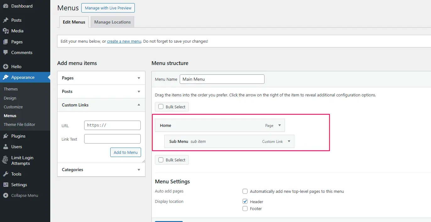
Step 4: How to Create Drop-Down Menus in WordPress
To organize your content hierarchically, you’ll want sub-menus (drop-downs). In this interface, it’s done simply by drag-and-drop.
Hover over any menu item in the right panel. You’ll see a crosshair icon. Click, hold, and drag the item slightly to the right, underneath the item you want it to be a child of. Release the mouse. The item will now be indented, signifying it’s a sub-item.
For example, you could have a “Services” parent item, with “Web Design,” “SEO,” and “Consulting” indented underneath it.
Step 5: Assigning the Menu Location
This is a crucial step. You’ve built the menu, but WordPress doesn’t know where to show it.
At the top of the screen (or sometimes at the bottom in a “Menu Settings” box), look for a section called “Display location.” Check the box next to the location you want this menu to appear in. Common locations are “Primary Menu,” “Header Menu,” or “Top Menu.” Once selected, click “Save Menu.”
Method 2: How to Create Navigation Menus with the Block Editor
If you’re using a modern block theme, the game has changed. You now design your menu visually.
Step 1: Enter the Site Editor
Go to Appearance > Editor. This launches the full-site editing experience where you can edit templates and template parts.
Step 2: Select Your Header
You’ll likely be editing the “Index” or “Home” template. Click on the header area of your site preview. A toolbar should appear. You want to edit the “Header” template part. You can click on the header and select the pencil icon to edit, or find it in the list view.
Step 3: Working with the Navigation Block
Inside the header, you’ll see your site’s logo/title and the menu. The menu itself is a Navigation Block. Click on it. You’ll see a toolbar with familiar block options.
Step 4: Adding, Removing, and Reordering Items
With the Navigation Block selected:
-
To add a new link: Click the “+” sign within the block. You can search for an existing page, post, or category, or type a custom link.
-
To reorder: Simply click, hold, and drag any menu item to its new position. The visual feedback is immediate and intuitive.
-
To create a dropdown: Drag a menu item slightly to the right, just like in the classic editor, or use the “Link” settings in the right sidebar to designate it as a sub-item.
-
To remove an item: Click on the specific menu item link, and in its toolbar, click the “Options” (three dots) and select “Remove.”
Advanced Menu Techniques for 2026
Once you’ve mastered the basics, it’s time to level up your site’s UX with these advanced techniques.
1. How to Create a Mega Menu
A mega menu is a large, expandable panel that appears on hover or click, displaying multiple columns of links, images, and even forms. They’re perfect for e-commerce stores or large content sites.
The simplest way to build a mega menu in 2026 is with a dedicated plugin. We recommend plugins like Max Mega Menu or JetMenu.
-
Install the Plugin: Go to Plugins > Add New, search for your chosen mega menu plugin, install, and activate.
-
Configure the Theme: Most plugins will add a new tab to your Appearance > Menus screen or create their own settings panel. You can usually set the menu width, animation, and breakpoints for mobile.
-
Build Your Columns: In the menu editor, you’ll typically have new options to create “Columns” or “Rows.” You’ll then drag your menu items into these new structures to build out the mega menu layout.
-
Add Content: High-end mega menus let you add widget areas. You can then drag a custom HTML widget into that area and embed an image, or use a “Recent Posts” widget to show dynamic content.

2. Best Mobile Menu Practices for WordPress
Your mobile menu is arguably more important than your desktop menu. In 2026, simplicity is key.
-
Limit the Items: Don’t try to cram your entire sitemap into a hamburger menu. Focus on the top 5-7 destinations.
-
Tap Targets: Ensure your menu buttons are at least 44×44 pixels to accommodate a finger tap.
-
Sticky Headers: Consider a sticky header that follows the user as they scroll, keeping navigation always accessible.
-
Test, Test, Test: Use tools like BrowserStack or Google’s Mobile-Friendly Test to see exactly what your users see.
3. Adding Icons to Your Menu
Icons add visual cues that help users scan your menu faster. You can add them in two ways:
-
Using a Plugin: Plugins like “Menu Icons” or “Font Awesome” integrate directly with your menu editor, allowing you to select an icon for each menu item.
-
Manually with CSS: If you know a bit of CSS, you can use a pseudo-element (like
::before) to add an icon font or SVG before your menu link text.
4. SEO Best Practices for Menus
Your menu sends powerful signals to search engines.
-
Use Descriptive Anchor Text: Instead of “Click Here,” use “Our Web Design Services.” This helps Google understand the content of the linked page.
-
Logical Hierarchy: Your menu structure should reflect your site’s information architecture. Top-level items should be your most important categories.
-
Limit the Number of Links: Don’t overwhelm users or search crawlers. A menu with 50 links dilutes the authority passed to each page.
Building Custom Headers with Elementor
If you want full visual control over your website header and navigation, Elementor’s Theme Builder allows you to design custom headers without touching PHP or theme files.
-
- Create sticky headers
- Design mega menus visually
- Add icons, animations, and custom breakpoints
- Control mobile behavior precisely
This approach is especially useful for businesses that need branded, conversion-focused navigation experiences. Since Elementor is a plugin, it’s important to first understand what a WordPress plugin is and how it works before moving forward.
WordPress Navigation Comparison: Classic vs Block vs Elementor
| Feature | Classic Menu (Appearance → Menus) | Block Navigation (Site Editor) | Elementor Header Builder |
|---|---|---|---|
| Ease of Use | Beginner-friendly, structured interface | Visual editing inside Site Editor | Fully visual drag-and-drop control |
| Design Flexibility | Limited to theme styling | Moderate customization options | Complete design freedom (sticky, mega menu, animations) |
| Mobile Controls | Theme-dependent | Basic responsive settings | Advanced responsive breakpoints |
| Mega Menu Support | Requires plugin | Limited support | Built-in via widgets & extensions |
| Best For | Simple blogs & standard sites | Modern block-based themes | Business, ecommerce & branded websites |
| Technical Skill Needed | Very low | Low to moderate | Low (no coding required) |
Frequently Asked Questions
Why can’t I see my menu on my website?
The most common reason is that you haven’t assigned the menu to a Display Location. Go back to Appearance → Menus and ensure you have checked the correct location box for your theme and saved the menu.
My dropdown menus aren’t working on mobile. How do I fix it?
This is often a theme compatibility issue. Touch devices handle hover states differently. The solution is to enable a click event instead of hover. Check your theme’s options or use a mobile menu plugin to switch the trigger from hover to tap.
What’s the difference between a menu and a navigation block?
A menu is the list of links and structure (the data). A navigation block is the visual container that displays that list in a block theme. The block controls the design; the menu controls the content.
Can I have different menus for different pages?
Yes. Many advanced themes and page builders allow you to assign different menus to specific templates. You can also use a conditional menus plugin for granular control.
How many items should I put in my main navigation?
For best usability, keep primary navigation between 5–7 items. Too many links create cognitive overload and reduce clarity.
Conclusion: Your Menu is Your Compass
Creating a menu in WordPress in 2026 is about more than just listing your pages. It’s about architecting a journey for your users, guiding them seamlessly from their point of entry to their desired destination—whether that’s reading a blog post, making a purchase, or contacting your team.
Start with the method that matches your theme (Classic or Block), build a logical, clean structure, and then refine the experience for mobile users. By following this guide from wpthrill.com, you’re not just building a menu; you’re building the foundation for a successful, user-friendly website.
Have you tried building a mega menu, or do you have a question about a specific theme? Let us know in the comments below. Before launching your website, make sure you follow our complete WordPress security guide to protect your site properly.